
Notto – Digital branding
En ny identitet kommer til syne
Tjenester
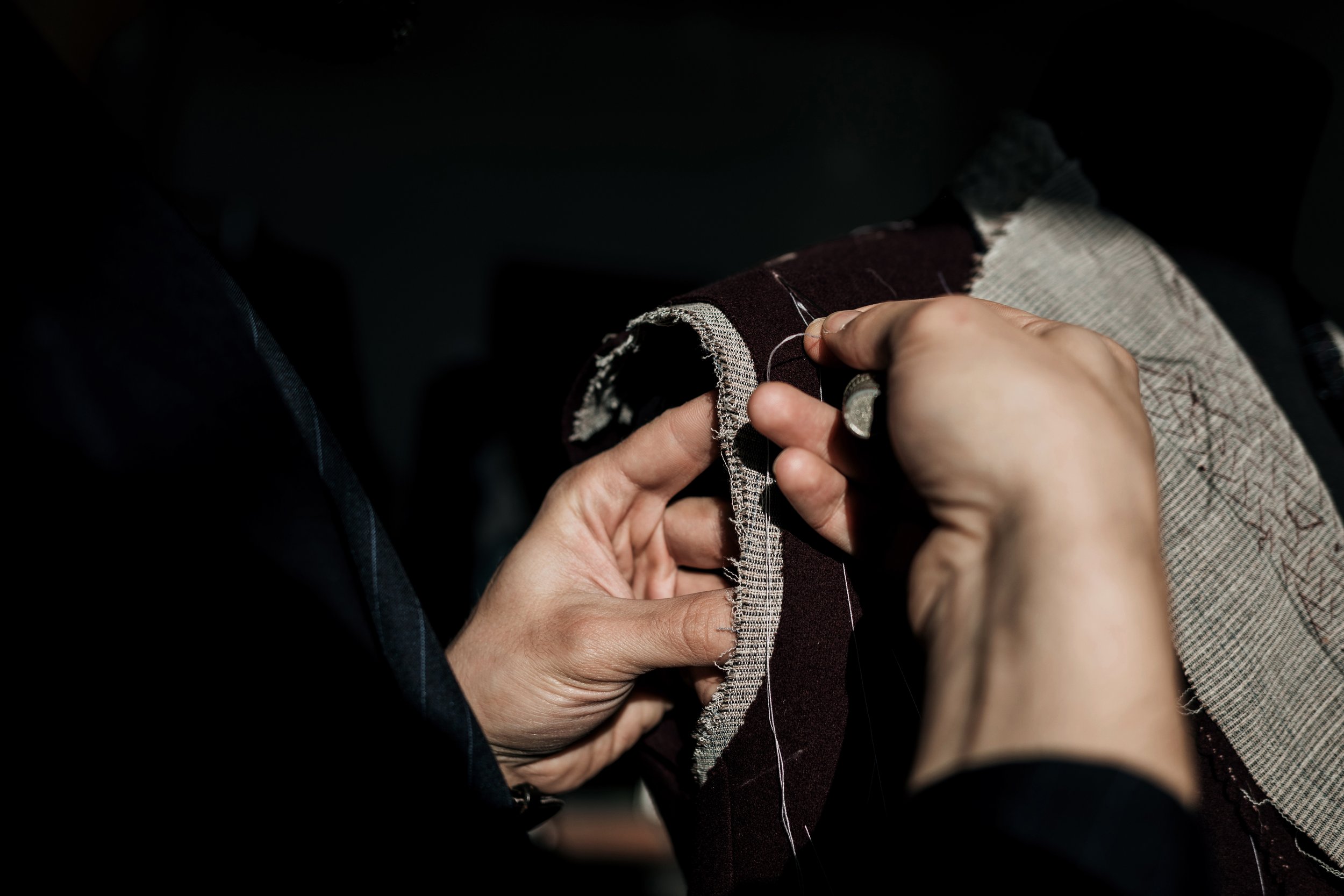
Bakgrunn og arv
Siden oppstarten på 1960-tallet har Notto utviklet seg til å bli Norges ledende leverandør av solskjerming, gardiner, tepper, akustiske løsninger og vindusfilmer. Gjennom årene har selskapet etablert et enestående rykte og har konsekvent satt standarder i bransjen for både kvalitet og innovasjon.
Deres ekspertise har vært etterspurt av noen av Norges mest prestisjetunge kunder, inkludert NRK, Norsk Hydro og Munchmuseet. Hvert av disse samarbeidene har ytterligere styrket Nottos posisjon som et anerkjent navn i bransjen, kjent for sin evne til å kombinere funksjonalitet med estetisk perfeksjon.
En visuell identitet som gjenspeiler kjernevirksomheten
I hjertet av Nottos merkevare ligger et visuelt konsept som er like innovativt som det representerer deres kjernevirksomhet. Deres spesialkompetanse innen solskjerming og gardiner har inspirert et design- og layoutsystem som reflekterer disse produktenes natur. Konseptet bygger på ideen om å avsløre og skjule – akkurat som gardiner trekkes opp og ned, eller persienner åpnes og lukkes, speiler Nottos visuelle identitet denne bevegelsen.
Designet avdekker eller skjuler gradvis elementer av merkevaren – som logoen, bilder og annet grafisk innhold – og skaper en dynamisk tilnærming som tilfører interaktivitet og dybde til den visuelle opplevelsen. Denne bevegelsen skaper en sterk metaforisk kobling til tjenestene Notto tilbyr, og omdanner bevegelsen av gardiner og persienner til et visuelt språk som formidler selskapets forpliktelse til både funksjonalitet og eleganse.
Fra konsept til praksis
I praksis blir dette designkonseptet implementert på en rekke medier og plattformer, fra digitale grensesnitt til trykt materiale. På nettsteder kan elementer for eksempel gli inn i syne når brukeren blar, noe som simulerer den gradvise avdekkingen av et gardin som trekkes fra. I trykt materiale gjenskapes denne effekten med overlegg og utfoldelser, noe som lar leserne engasjere seg med innholdet på en taktil og nesten teatralsk måte.
Fargepaletten og typografien som er valgt for Nottos merkevarebygging, forsterker ytterligere dette konseptet. Myke, dempede toner vekker følelsen av naturlig lys som filtreres gjennom stoff, og innprenter en følelse av ro og sofistikasjon. Typografien er ren og moderne, med nok tyngde til å fange oppmerksomheten uten å overskygge de dynamiske visuelle elementene.
Fra idé til begeistring
Denne visuelle identiteten reflekterer og forsterker Nottos kjerneverdier og virksomhet. Ved å hente inspirasjon fra deres nøkkelprodukter – solskjerming og gardiner – har vi oversatt disse til et dynamisk, interaktivt designspråk som fanger essensen av både innovasjon og tradisjon.


